 DigiUsher Documentation
Radar
Find the cost changes worth investigating, with the evidence behind each one.
Radar reports the unusual cost behavior that DigiUsher finds in your bills. This behavior is a spike, a change of pattern, or a resource that appeared or disappeared. Open Radar from Spend > Radar in the left sidebar.
Use Radar when you need to:
- Find the cause of an unexpected bill.
- Read the cost changes of the month in the order of their impact.
- See the evidence behind a marked day, and not only the mark.
- Separate a real cost increase from a cost that moves from one pool to another.
- Get an alert for the anomalies inside a saved SpendIQ perspective.
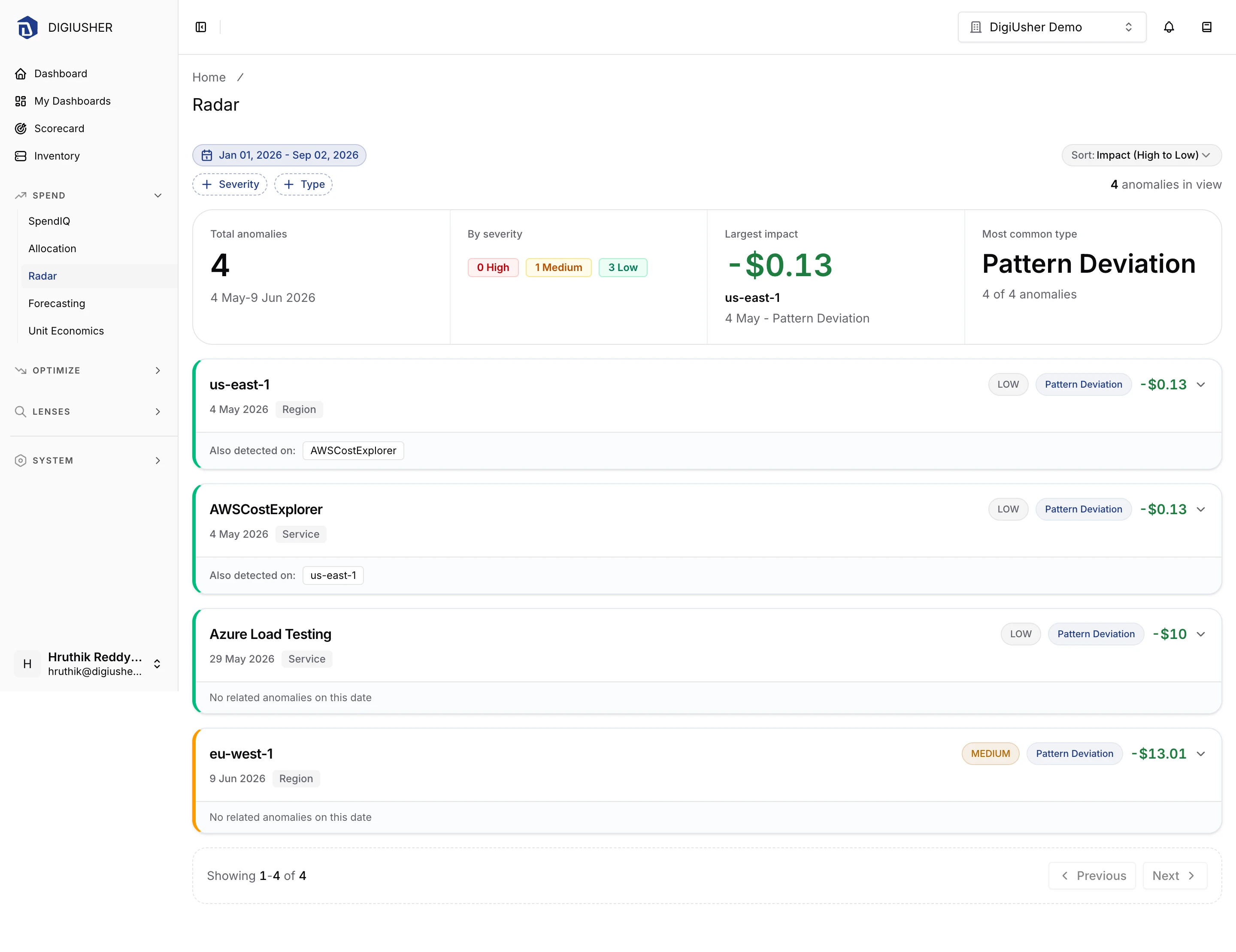
The badge beside Radar in the sidebar counts the anomalies of the current month up to today, without a filter. The page itself uses the date range that you select. The number in the badge and the number above the timeline are therefore often different.
Filters
| Filter | Options |
|---|---|
| Severity | High, Medium, Low |
| Type | Cost Spike, Pattern Deviation, Resource Inefficiency, Unexpected Resource |
| Date range | Any range, or a preset such as This month, Last month, or Last quarter |
| Sort | Impact (High to Low) (default), Impact (Low to High), Date (Newest), Date (Oldest), Severity, Score |
Severity and Type are multi-select. Select the values, then click Apply.
Clear all appears after you set a filter chip, and it removes the chips only. The date range and the sort order are the anchors of the view, so they do not change.
Summary
Four cards summarize the anomalies that match your filters and your date range:
- Total anomalies gives the number of anomalies in the selected range.
- By severity gives the number at High, at Medium, and at Low.
- Largest impact gives the one anomaly with the highest cost impact. It also gives the object of the detection, the date, and the type.
- Most common type gives the type with the most anomalies, and its part of the total.
If you look for the cause of a bill, start at Largest impact. If you look for a systemic problem, and not a single event, start at Most common type.
Timeline
Each anomaly is a card in the timeline. A card gives:
- The object of the detection, as the title.
- The severity, as a colored pill and a colored left border.
- The type.
- The cost impact. Red is an increase, and green is a decrease.
- The date of the detection.
- The scope of the detection.
- Also detected on:, which lists the other objects marked on the same date. If there are none, the card reads No related anomalies on this date.
When you sort by Date (Newest) or Date (Oldest), the cards are grouped under date headings. Every other sort gives a flat list.
Under the timeline, the pagination gives the range that you read, for example Showing 1-50 of 127. It also has Previous and Next.
Scopes
The detection runs at several scopes. One change in your costs can therefore appear more than one time: as an anomaly at the level of a service, and as the anomaly at the level of the organization that it creates. The scope on a card is one of these:
| Scope | The anomaly was detected on |
|---|---|
| Organization | Total spend for the organization |
| Data Source | One connected data source |
| Service | One cloud service |
| Region | One region |
| Pool | One allocation pool |
| Perspective | The cost matching a saved perspective's filters |
To find a cause, start at the narrow scopes. To see whether the whole bill moved, start at Organization.
Anomaly detail
Select a card to open its details in the same place.
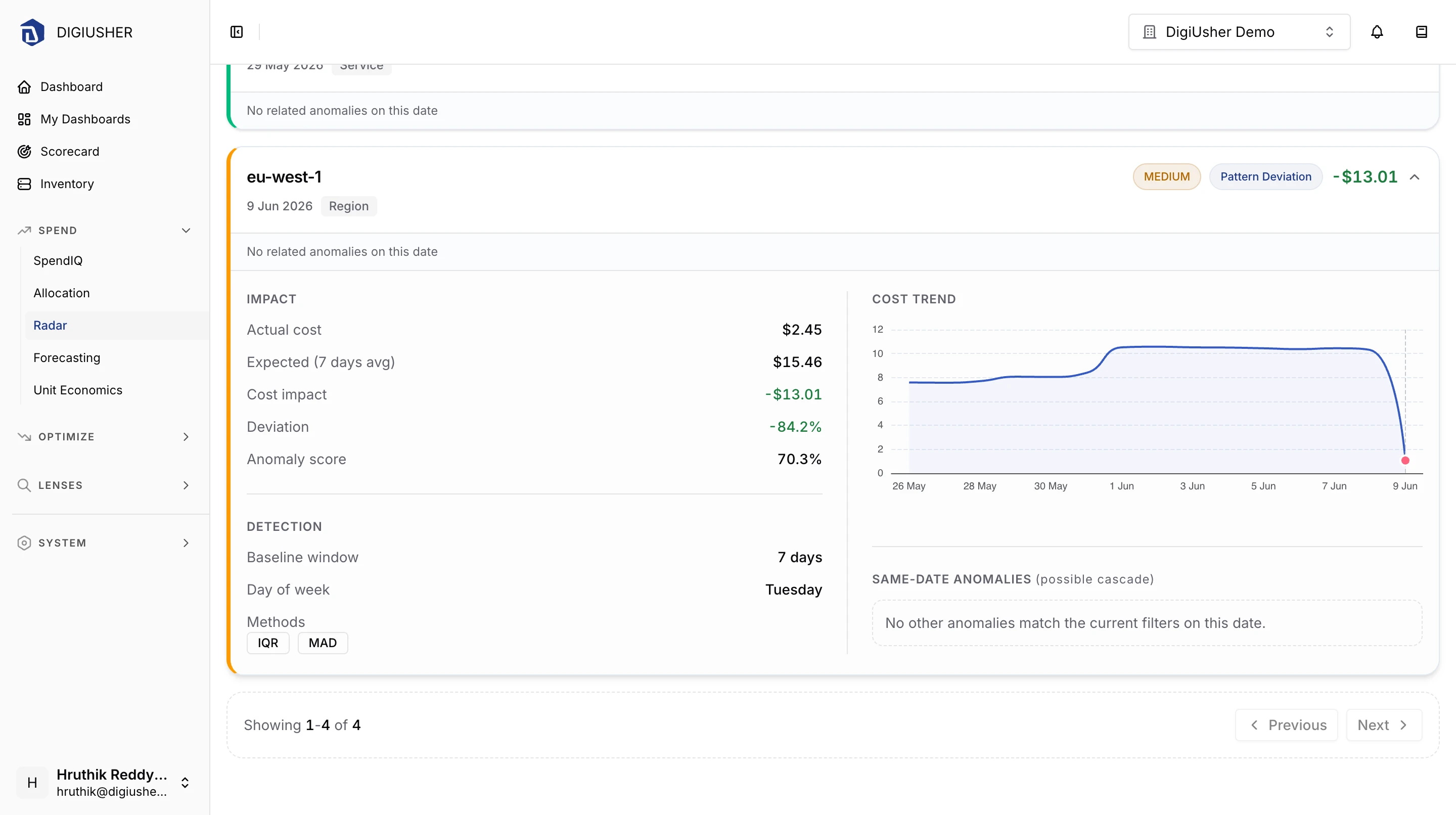
Impact
| Field | Description |
|---|---|
| Actual cost | The real cost of the day |
| Expected (n days avg) | The cost that the baseline predicted for that day |
| Cost impact | The actual cost minus the expected cost |
| Deviation | The change in percent against the baseline |
| Anomaly score | The size of the deviation of the day, in percent |
Detection
| Field | Description |
|---|---|
| Baseline window | The number of days of history behind the expected value |
| Day of week | The weekday of the marked date, because many cost patterns repeat each week |
| Methods | The detection methods that agree, for example IQR, ZSCORE, MAD, or STRUCTURAL_DIFF |
Cost Trend plots the daily cost from 14 days before the anomaly to 7 days after it. You can then see whether the marked day is a single event or the start of a new level.
Same-date Anomalies (possible cascade) lists the other anomalies of the same date, with the largest impact first. It also names the scope that probably holds the root cause, for example Check the Service-level anomaly for the likely root cause.
How detection works
Two independent detectors run over your daily costs.
Statistical detection
Three methods examine each cost time series:
| Method | What it flags |
|---|---|
| IQR | Days outside the interquartile range fences, at 1.5 times the interquartile range |
| Rolling Z-score | Days more than 2.5 standard deviations from the 7-day rolling mean |
| MAD | Days more than 3.5 median absolute deviations from the median |
DigiUsher marks a day only when at least two of the three methods agree. Three more filters keep the number of anomalies low:
- The cost impact must be $10 or more.
- The deviation must be 5% or more.
- The series must have at least 7 days of history.
Because of this agreement rule, Radar reports many fewer anomalies than an alert with one threshold. For the same reason, the Methods field is useful: a day that all three methods mark is a stronger signal than a day that two methods mark.
Structural detection
Structural detection compares the entities that exist in two periods. It does not compare their cost. The baseline is the period of 30 days that ends 7 days ago. The current period is the last 7 days.
- A new entity exists now, but it does not exist in the baseline. An example is a service that started.
- A disappeared entity exists in the baseline, but it does not exist now. An example is a region that you closed.
Each detection run reports at most 20 new entities and 20 disappeared entities. A large migration therefore cannot fill the page.
Severity
| Severity | Statistical | Structural |
|---|---|---|
| High | More than 100% increase, or a score above 0.85 | A new entity costing $100/day or more |
| Medium | More than 50% increase, or a score above 0.65 | A new entity costing $10/day or more, or a disappeared entity costing $100/day or more |
| Low | Everything else that passed the filters | Everything else |
Alerting on a perspective
Radar reports what it finds. An anomaly configuration of a perspective decides which anomaly gets an email. Each configuration adds anomaly rules to a saved SpendIQ perspective. The alert goes out only when the anomaly passes both the cost impact threshold and the severity threshold.
Open System > Guardrails, then the Anomalies card, to reach Perspective Anomaly Configs. Click New config to add one.
Pick a perspective
Select the saved perspective to monitor. The list gives the SpendIQ perspectives only. It does not give the system perspectives or the perspectives without a filter. The detection uses the filters of the perspective. It ignores the grouping and the other settings.
Set thresholds
Min cost impact sets the smallest cost impact that sends an alert. Enter 0 to get an alert for every anomaly.
Min severity sets the lowest severity that sends an alert. LOW gives every anomaly, and HIGH gives the largest anomalies only. Most teams start at MEDIUM, which is the default.
The step gives the resulting rule as a sentence before you continue.
Review and create
Make sure that the perspective, its filters, and the two thresholds are correct. Then create the configuration.
The list gives each configuration with its Perspective, Source, Min severity, Min cost impact, and creation date. You can edit a configuration or delete it. The perspective of a configuration is fixed at the creation. To monitor a different perspective, delete the configuration and create a new one. When you delete a configuration, its alerts stop, and the perspective itself does not change.